
BACKWORKS Logo Design & Branding
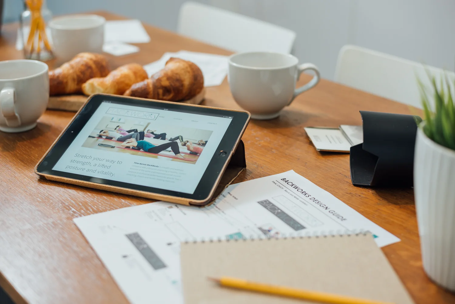
In 2016 we were approached to help create a complete branding package for BackWorks – a health and wellness company with a focus on Pilates, Deep Stretching and Nordic Walking. We met with our client, Tiina Aarnio, in early spring for our kick-off meeting. We were creating the branding from scratch, which meant coming up with a fresh new logo, designing business cards, product photography, flyers, posters, as well as a visually appealing and user-friendly website.
STAGE 1: DESIGNING THE LOGO
Our first step was to come up with the BackWorks brand identity. As a new company we wanted the logo to incorporate the BackWorks name but to also include a visual element of movement. We sat down with Tiina and researched design elements she liked and disliked, which helped us get a better idea of her expectations. We also knew that it needed to work for both print and digital mediums.

Putting ideas onto paper
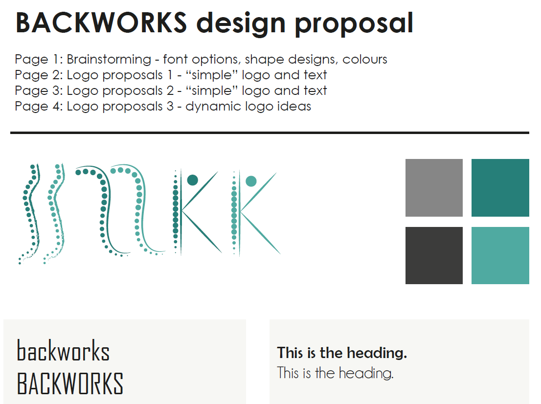
The Design Elements
BackWorks focuses on healthy movement of the spine so having some design element with a spine was my starting point. I also knew I wanted to take a clean, sans serif Font – something thin and modern.
For the color palette, we liked the idea of a light turquoise – something gender neutral, fresh – to represent how great the clients will feel after all that moving!
Refinements
Once we had the colors and the spine design combined, we needed to make sure the logo really stood out, especially on a busier poster. We experimented with some framing options and narrowed down our proposals. A couple more meetings and a bit of refinement later, we had our final logo:

Design Guidelines
After deciding on the logo, fonts and colour scheme, we put together a brief summary of the design elements. It’s a one-page design guideline showing how the logo is built up, the different colour formats and fonts used & quick notes about how & when they should be used. The guidelines help us keep consistency between the different mediums and unify the look of the brand throughout the whole process. Additionally, our client can now take this guideline to other creatives if needed as a reference point.
STAGE 2: INCORPORATING THE LOGO
The next step was to design the business card and flyers using the new logo.
We wanted to keep the business card clean and professional with a fairly “traditional” layout design.
For the flyer, on the other hand, we had a lot more information to consider – like class times, pricing, photos and short descriptions of each service so we tried out a few layout variations before choosing the final version.

Throughout this layout process, Fred organised the photo shoots and started on the website structure. Once we had the final photos, we finalized the flyers and poster.
In the next two sections we will be looking into the various photoshoots we did for BackWorks, as well as putting everything together in digital form to create a website that is both informative but also aesthetically fitting to the brand.
If you'd like to learn more about our projects and services, you can reach us anytime at hello@gipfelicollective.ch